The biggest challenge I've faced through this project? Well, the hardest part for me is the beginning, soaking it all in to put it to work. My first typography(see below) didn't turn out the greatest. I feel as if I'm improving as I go along. I get along with it by figuring out how I can improve, or how I can work around the obstacle. Most of our assignments we receive in G.T are difficult and we still work through it. The reasoning behind this is because we are persistent and don't stop trying.
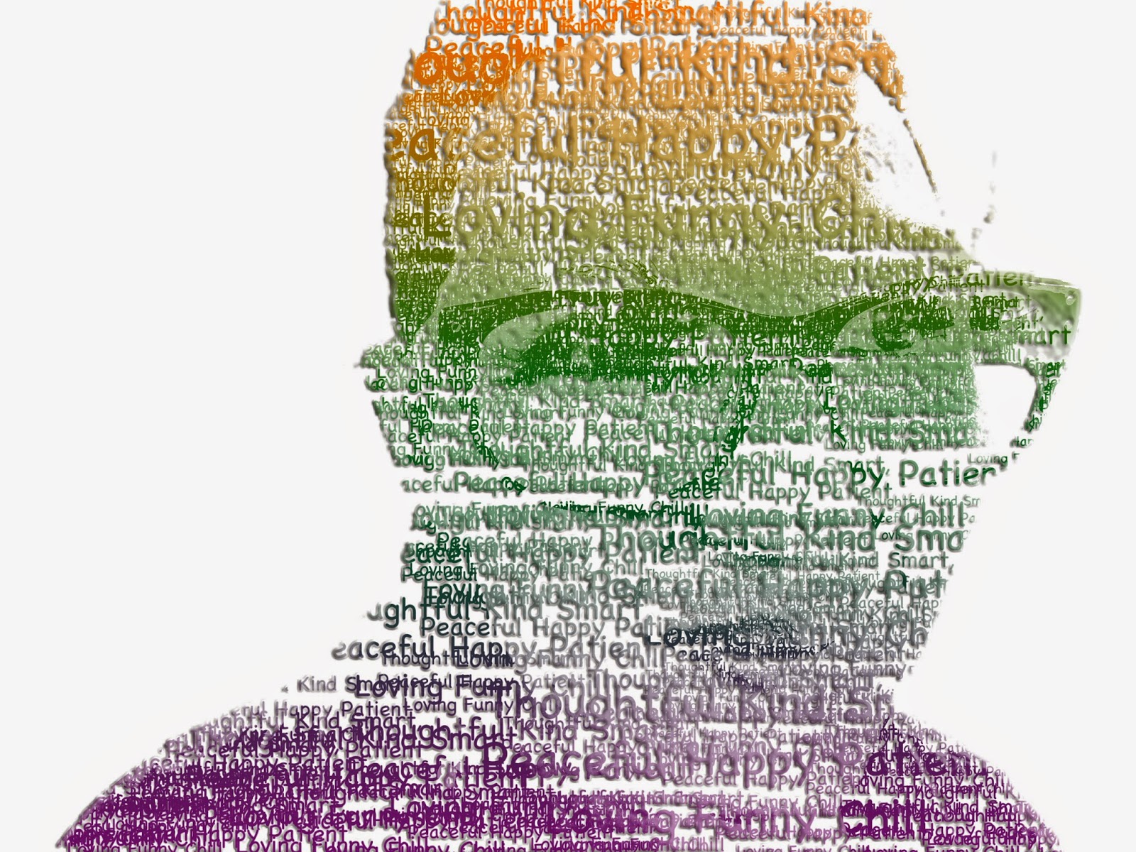
For my first example, I have a typography image of Thomas Edison. This one is probably my worst work because I rushed it, not putting forth my best effort. In my second typography, I feel as if this one is the best because the picture was already taken with good highlights, shadows and midtones. I added a bevel and an emboss to the picture for the words to pop, if I didn't add one, it would look much less realistic. For my third and final picture, I find it ok, but not the best. It took me a long time to posterize the image and fix it.


No comments:
Post a Comment